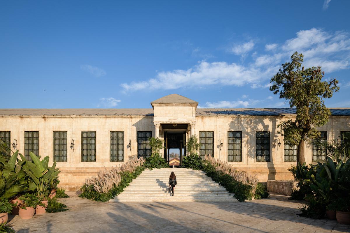
The Grand Egyptian Museum is a difficult setting for any commercial space to inhabit. Its scale, architecture and proximity to one of the world’s most significant collections of ancient Egyptian artifacts give the museum an exceptionally strong visual and cultural identity of its own. For the designers and brands who were approached by the GEM for their stores, the challenge was how to situate a commercial identity within a space that already commands so much attention.
Across five recent projects at the GEM, some have grappled with ancient Egyptian references as a source for storytelling and symbolism; others have deliberately kept their language subtle, allowing the brand to remain dominant; and some have adopted the language of the museum itself through materiality and methods of display, looking at objects that sit between artwork and artifact. Taken together, the projects offer different ways of negotiating the relationship between retail and the context in which it’s situated.
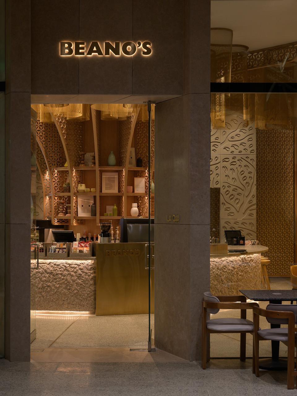
For Shewekar El-Gharably, who designed the acclaimed GEM branch of Beanos, the starting point was storytelling. Having worked with the home-grown coffee brand on previous projects, the designer wanted the store to reflect the brand’s visual identity and the cultural significance of its location.
“One of the things I love to do most is tell a story through my work,” she explains
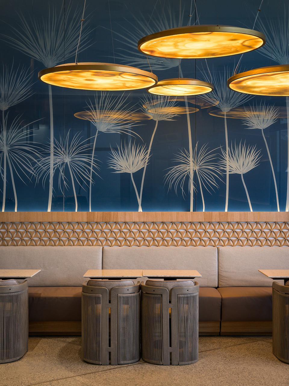
At the GEM, that story was drawn from an array of references to ancient Egypt: the Nile, the papyrus symbol, the Sun and its symbolism of daily rebirth, the Tree of Life and locally sourced materials became the foundation of the store’s narrative and design.
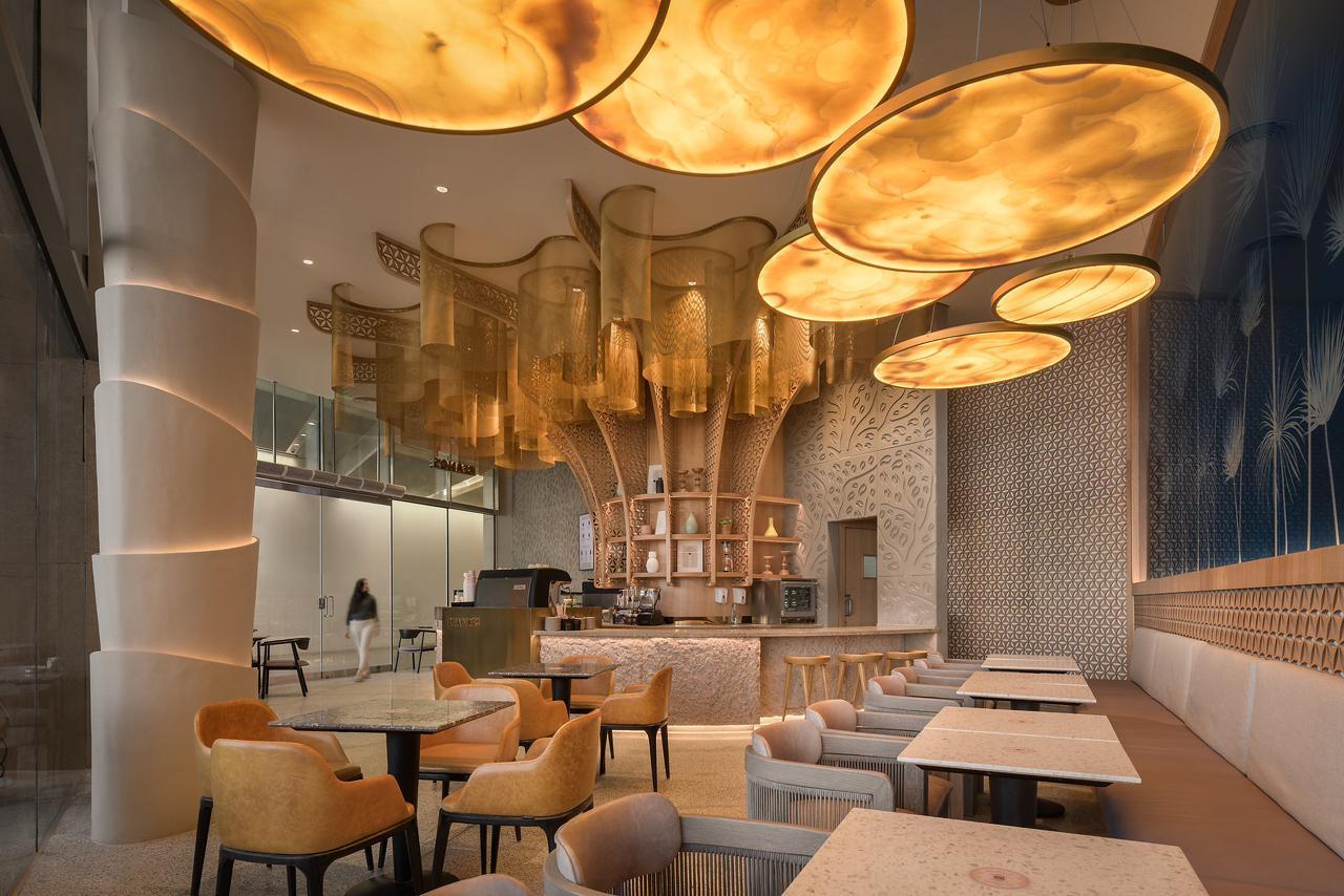

At the centre of the store, a large sculptural tree installation rises as a contemporary interpretation of the banyan trees planted along the Nile during the era of Khedive Ismail, also referencing the ancient Egyptian Tree of Life. Papyrus grows from a glass backdrop, its slender forms set against the translucent surface.
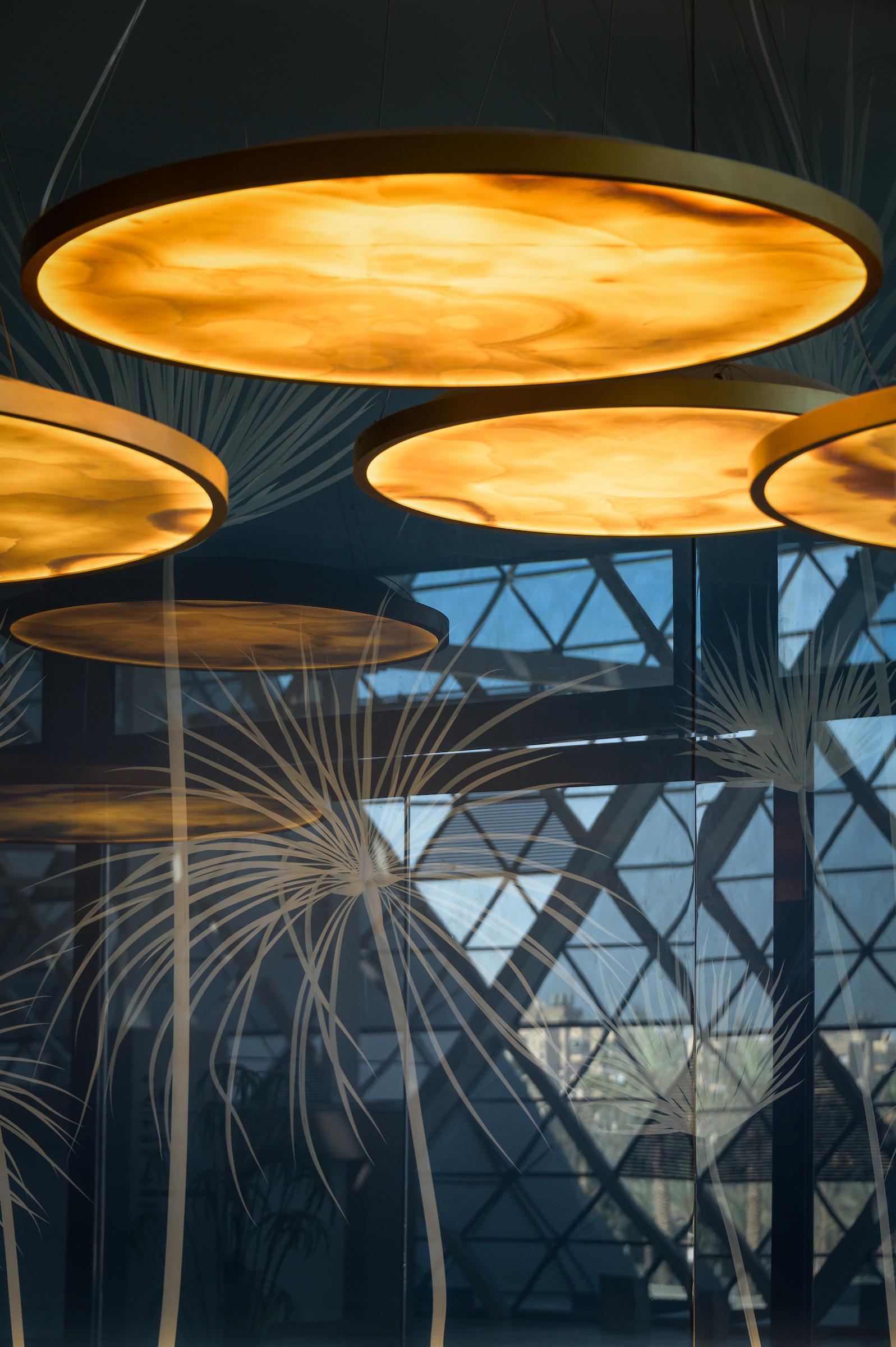
Circular motifs suspended from the ceiling visually translate the Sun, and copper inserts spread across the floor like traces of its rays. Aswani granite and alabaster introduce earthy textures into the space, complemented by handwoven chairs that mirror the forms and techniques of ancient Egyptian furniture.
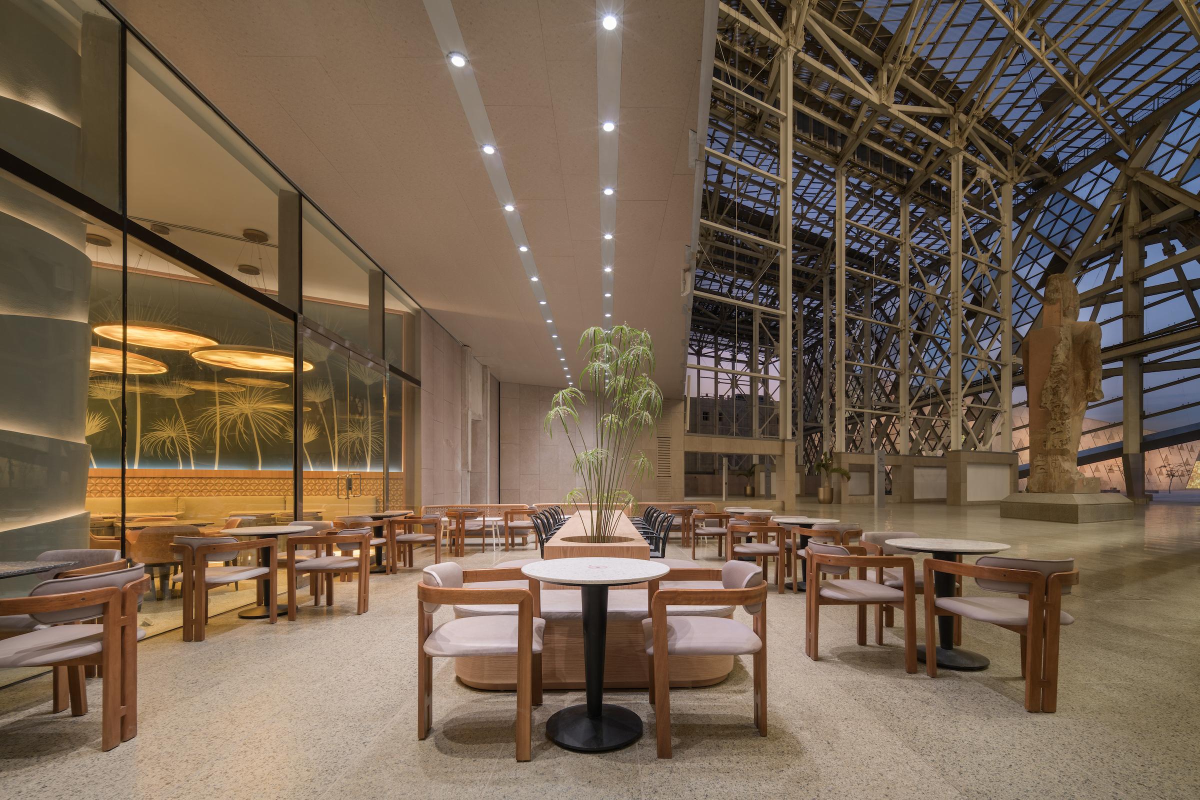
El-Gharably’s design also had to account for the objects already occupying the store’s surrounding environment. Beside the iconic Ramses statue, Beanos’s outdoor area remained intentionally subtle, allowing the monument to remain the most distinguished element of the setting. “Nothing could have been in conflict with it,” she says. Inside the store, Beanos’s communal table anchors the space, carrying through a sense of warmth and gathering that El-Gharably describes as the brand’s “homey” quality. Together, these Egyptian references form an integral part of the store’s energy and spatial language, while familiar elements of Beanos keep the space recognizable.
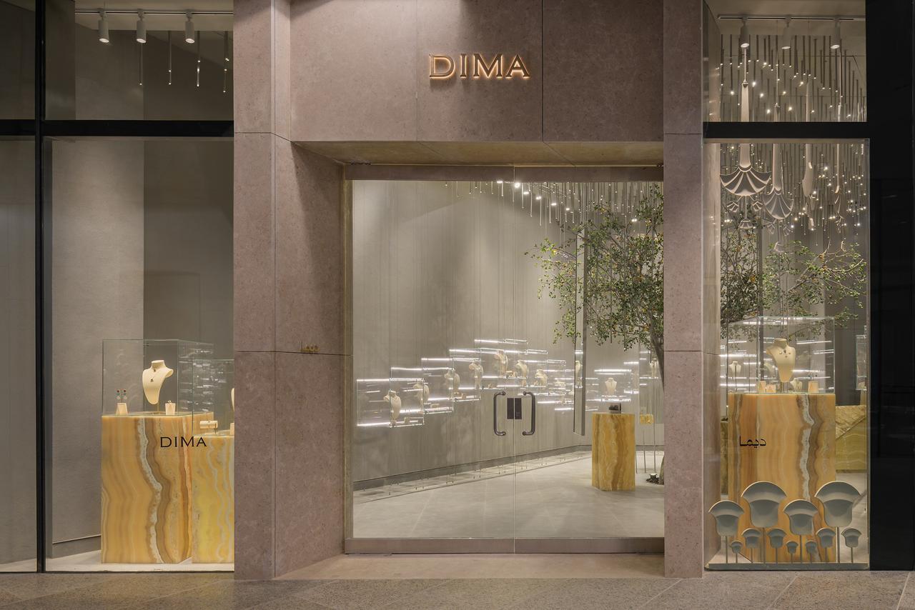
With Dima, Shosha Kamal took a quieter approach to the GEM store. The designer was commissioned to develop a new visual identity for the jewelry brand, with the GEM branch serving as its first physical space post-rebrand. The challenge for the designer was to create a space in dialogue with the museum while establishing a new identity for the brand that could stand independently beyond it.
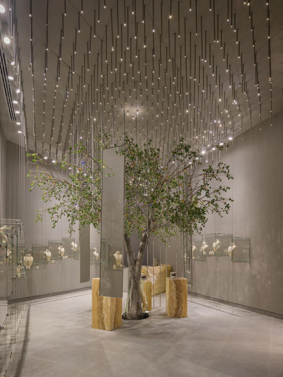
The store’s central feature is a bejeweled tree from which delicate gemstones appear to grow, translating Dima’s emphasis on gems into a surreal, whimsical form. Suspended displays add to the store’s weightless quality, and reflective surfaces make the space feel larger as the displays appear from different angles. Kamal explains that the deliberate decision to avoid using gold in the store’s interiors allowed the jewelry to retain visual dominance. “You need the product to shine, not your design,” she says.
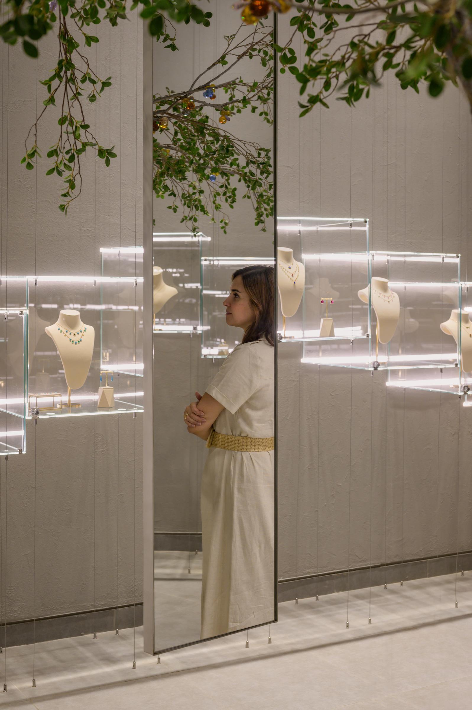
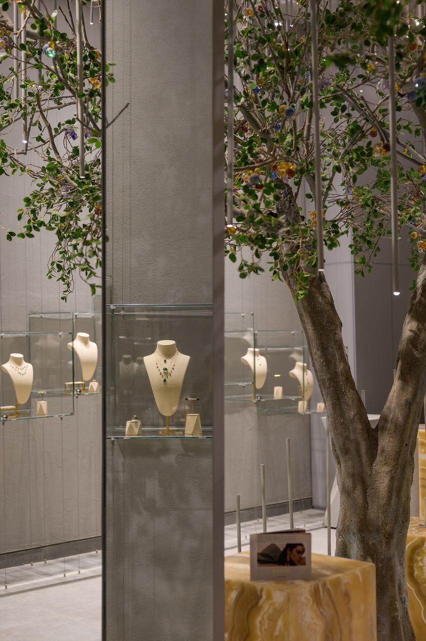
The experience of the illuminated tree extends into the store’s mirror displays. When visitors stand before a mirror to try on Dima’s jewelry, the gemstone tree appears in their reflection, drawing them into the store’s visual world. The combination of mirrored and reflective surfaces expands the rather intimate space, allowing the store’s sense of whimsy to become part of the visitor’s experience.
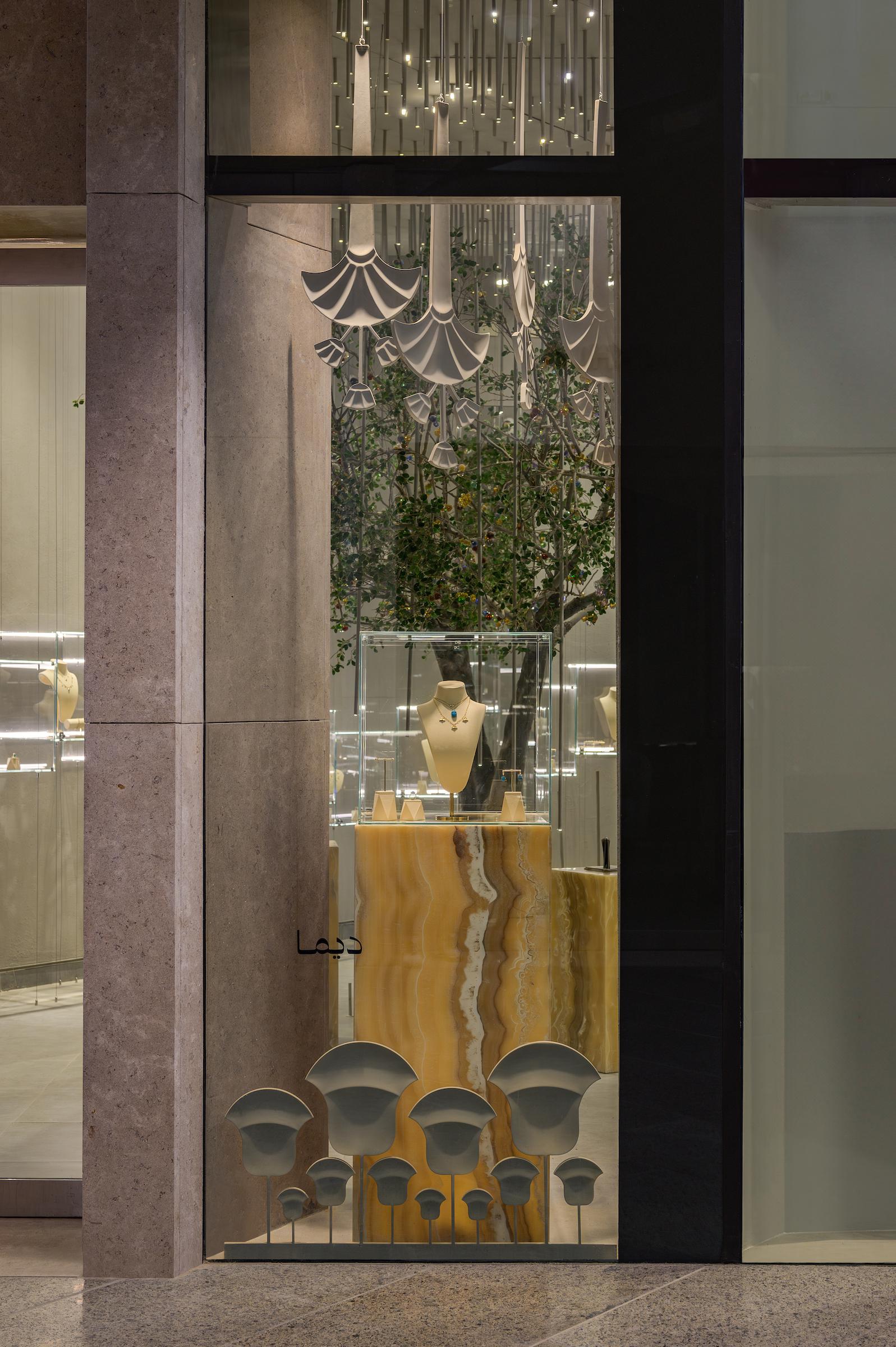
Dima’s references to the GEM were designed to remain understated, with a clear distinction between the exterior and interior of the store. The window display establishes a recognizable connection to the museum, with a lotus motif and alabaster displays transitioning the viewer into a more subdued interior.
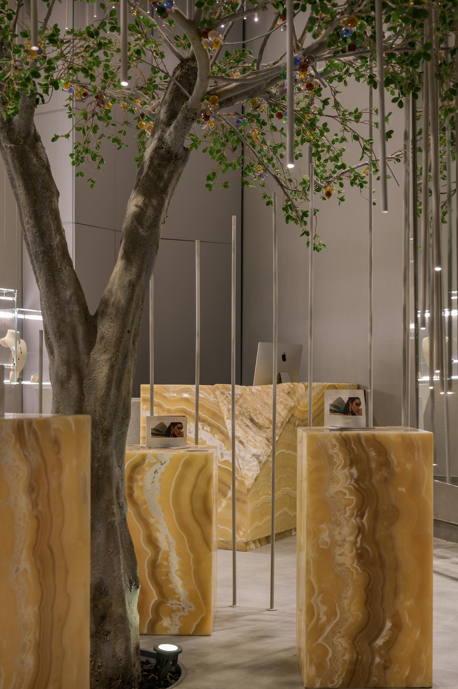
Inside, alabaster continues through the pedestals and counter, but the relationship to the museum itself becomes increasingly subtle. “It had to be very embedded,” Kamal states. The designer also deliberately avoided figurative representations, conscious of the monumental sculptures surrounding the shop. In a setting already filled with iconic objects, she mentions that “there was little reason to compete with them.”
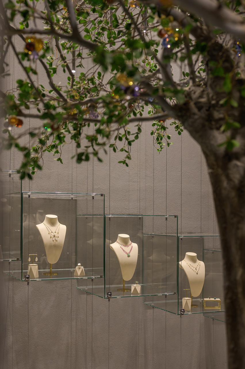
The store’s visual language also extends beyond the physical space through its photographs. For Kamal, the photographer becomes another interpreter of the design, translating the concept and narrative into a new visual form. She describes the process between designer and photographer as collaborative, allowing the photographer to discover details and viewpoints she may not have considered herself. “When you see people translating your creations, it gives them a new flavor and fresh perspective on your own work,” she says. “You start gathering insights and noticing things you wouldn’t have noticed otherwise.”

For Nakhla, Yasmina Makram’s engagement with the GEM takes an alternative route, drawing directly from the museum’s methods of display and bringing retail in conversation with museology.
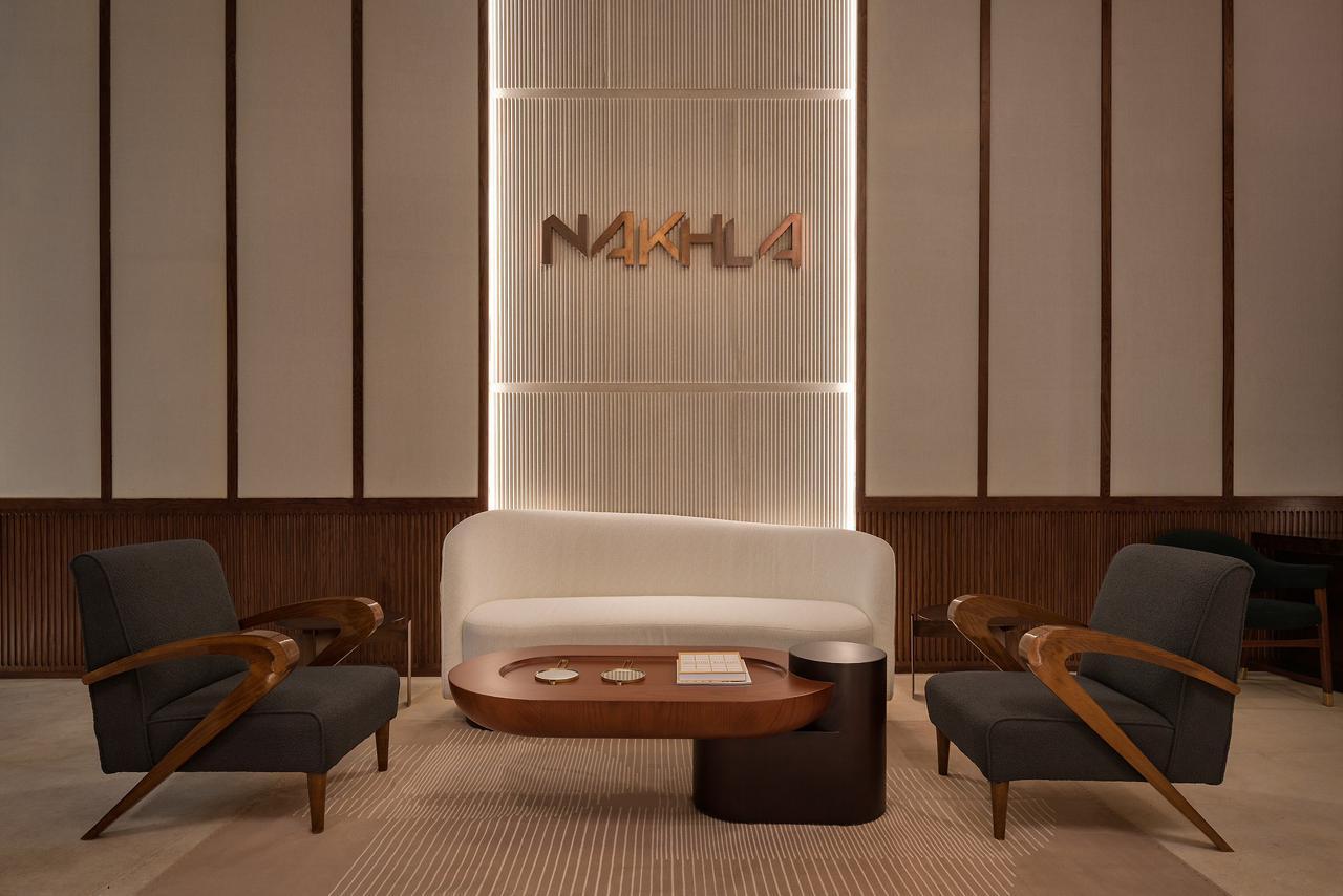
Designing the jewelry brand’s luxury retail showroom, Makram found a noticeable connection between a jewelry house deeply rooted in Pharaonic references and a museum housing one of the world’s largest collections of ancient Egyptian artifacts. In the store, Makram engages with this history by exploring the visual language and materiality of the museum itself.
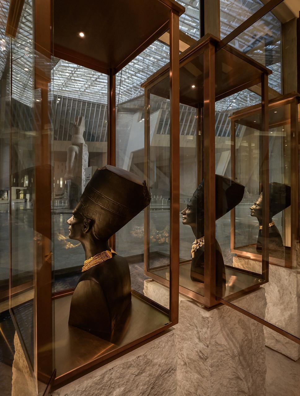
A visible example is a series of six Nefertiti busts produced in collaboration with Egyptian sculptor Nathan Doss. In a conversation with the designer, Makram refers to the sculptures as deliberate “copies” that she positions like found ruins within the store. Nefertiti’s famously elongated neck and graceful profile made the reference particularly fitting for the jewelry brand.
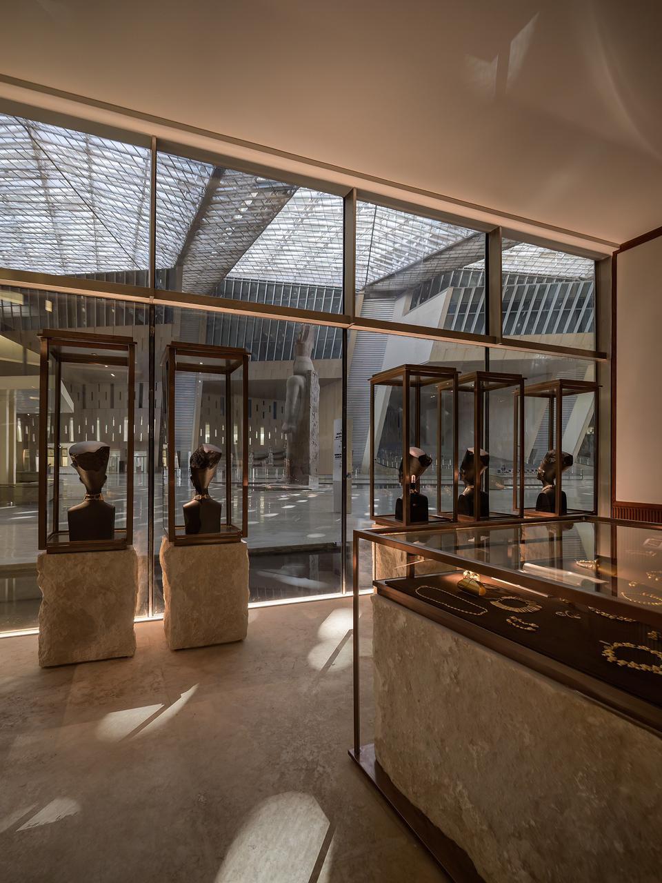
This engagement extends into the store’s display units, which also reference the architecture of ancient temples: large blocks of travertine draw inspiration from the monumental stones of Egyptian temples, and the colors reflect the faded yellow limestone tones of the museum. Nakhla’s products were framed, lit and contextualized as part of a larger visual composition, where Makram worked with lighting specialists Enlighten to ensure that the jewelry, tiny in scale beside the museum’s monumental sculptures, received precise illumination.
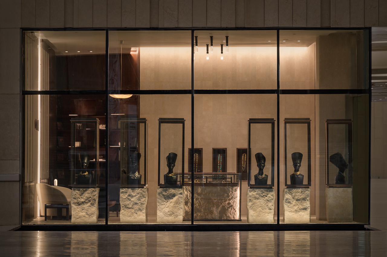
Makram’s design approach to the GEM store draws in part on her engagement with Egyptian history and material culture. The designer describes her practice as “rooted in history and geography while remaining understated in our use of materiality.” This extends to the collaborations and objects brought into Nakhla’s showroom.
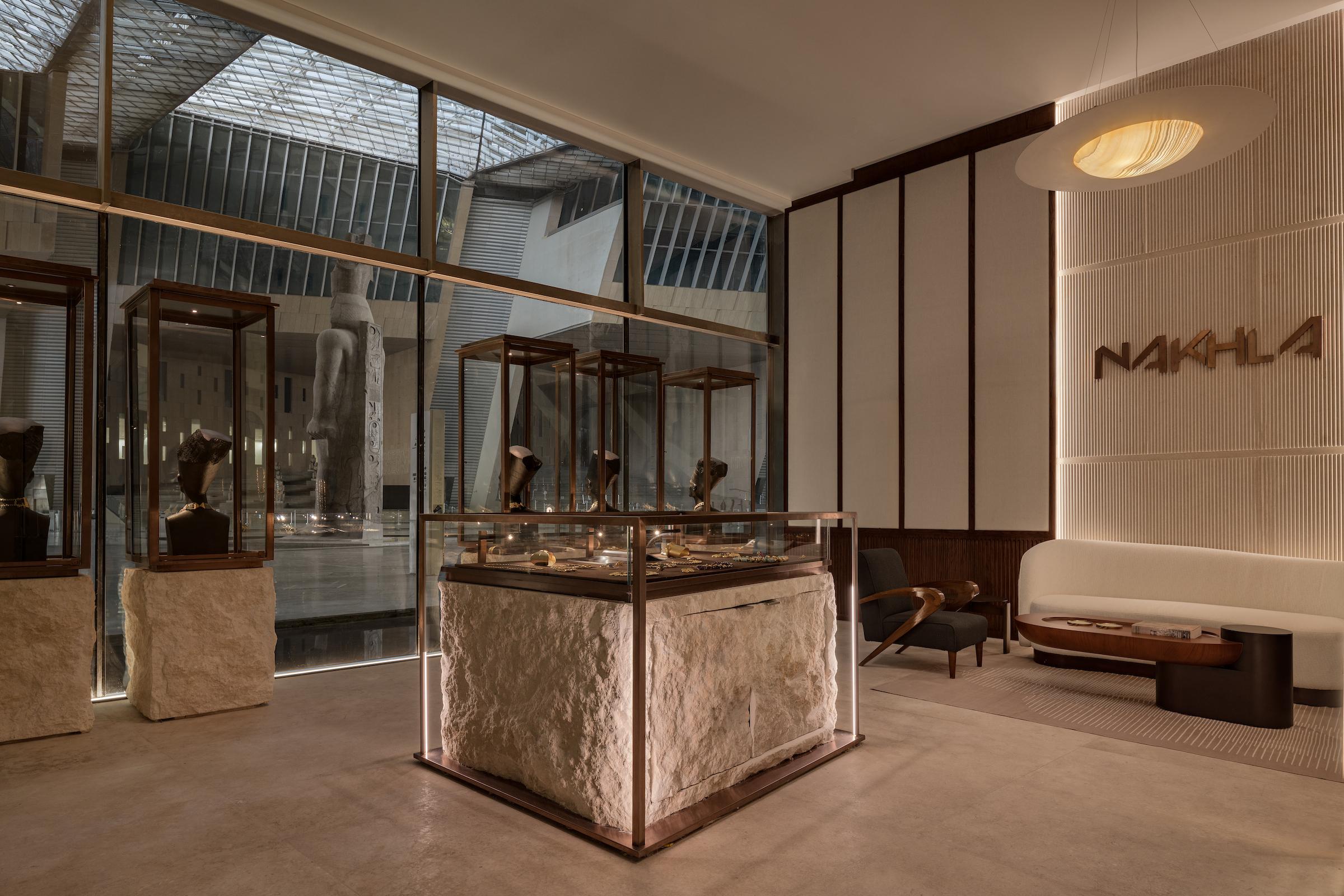
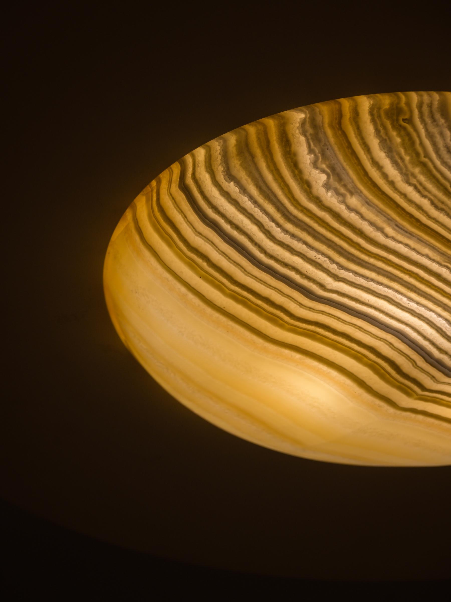
Egyptian artist Omar Chakil designed an elliptical alabaster light installation inside the store’s main salon, and collected furniture sourced from across Egypt - some of which had previously belonged in Egyptian homes - brought their own histories into the space and created a sense of continuity. Alongside a newly designed coffee table by Yasmina Makram and contemporary artworks, these elements allowed the space to showcase multiple expressions of Egyptian history and design.
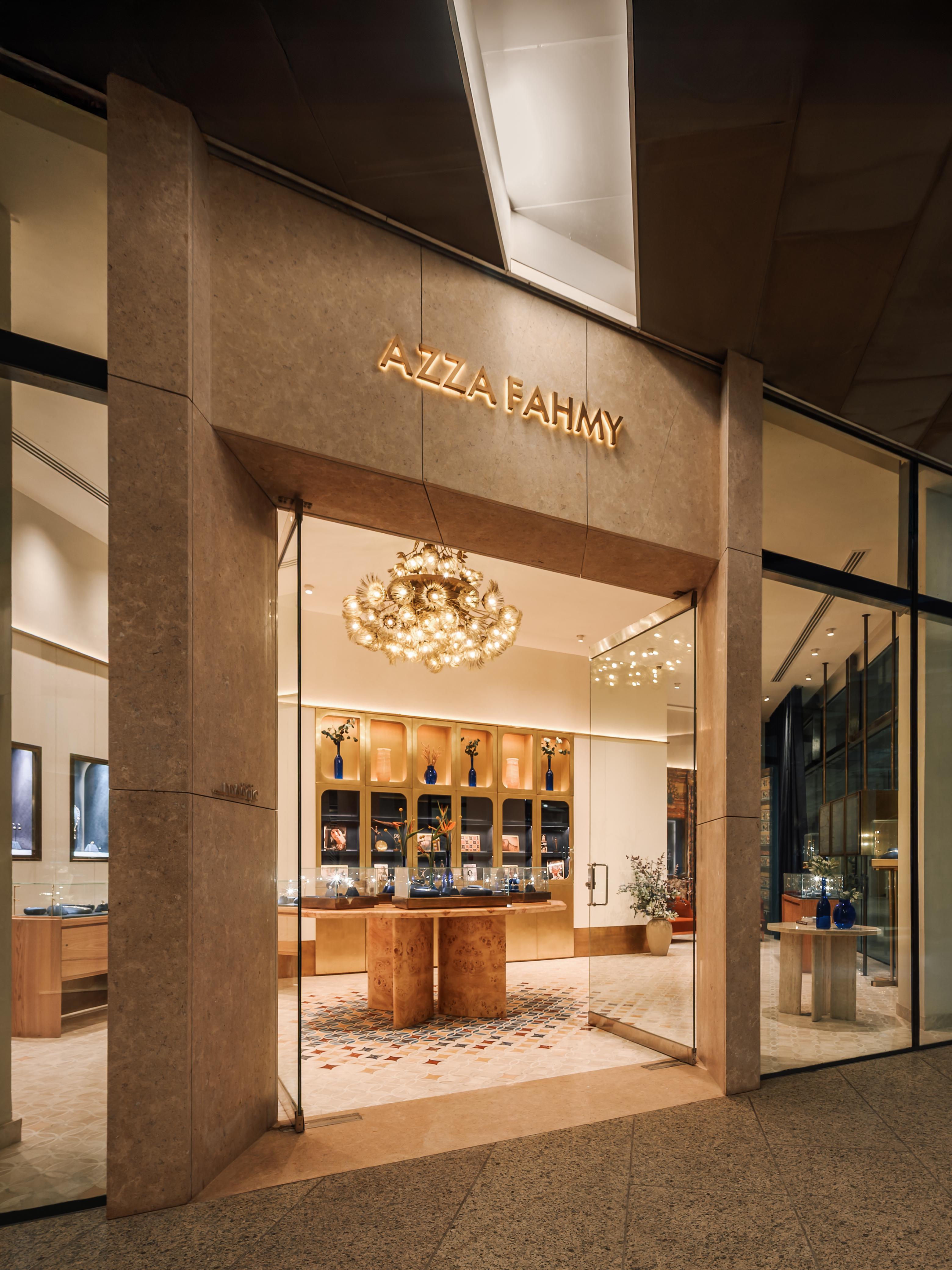
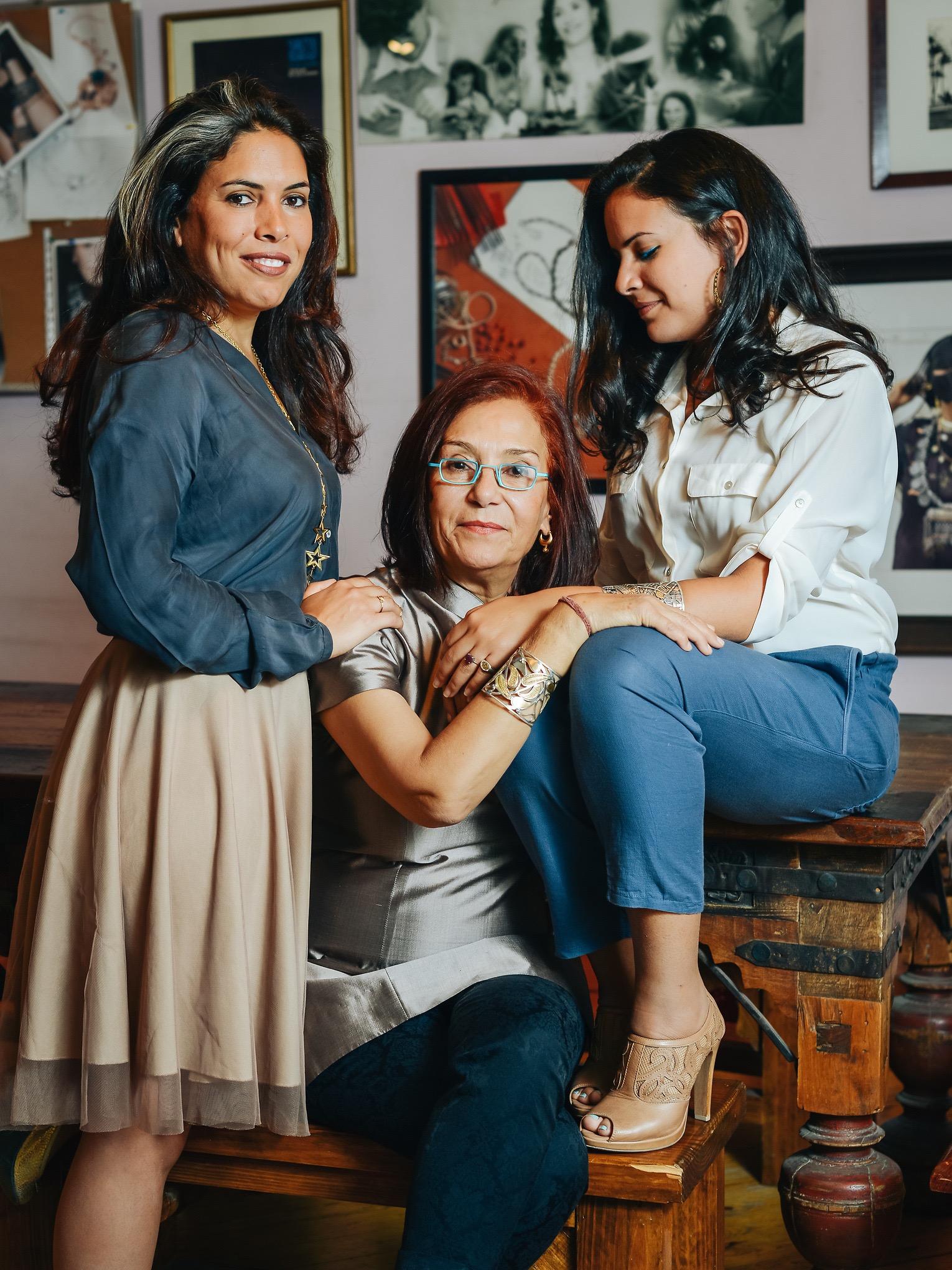
For Azza Fahmy, history and craftsmanship are deeply embedded in the brand’s visual identity. For the store, renowned London-based Universal Design Studio undertook a three-week discovery process with the Azza Fahmy team, visiting the founder’s home and studio as well as the brand’s workshop. The process offered an opportunity to understand the research and craftsmanship behind each collection, and became the basis for a store that reflects the brand’s layered approach to storytelling.
The designers approached the interior as an extension of the research and storytelling that have long defined Azza Fahmy’s relationship with ancient Egyptian heritage. “We wanted the interior to create a contemporary interpretation of the same spirit of research and storytelling that underpins both the museum and Azza Fahmy’s work,” Design Director Suzanne Gaballa explains. The traditional jewelry retail format was rethought around a series of spaces and objects that could tell stories at different scales. Furniture was an important part of this design approach, bringing in pieces from Azza Fahmy’s own home.
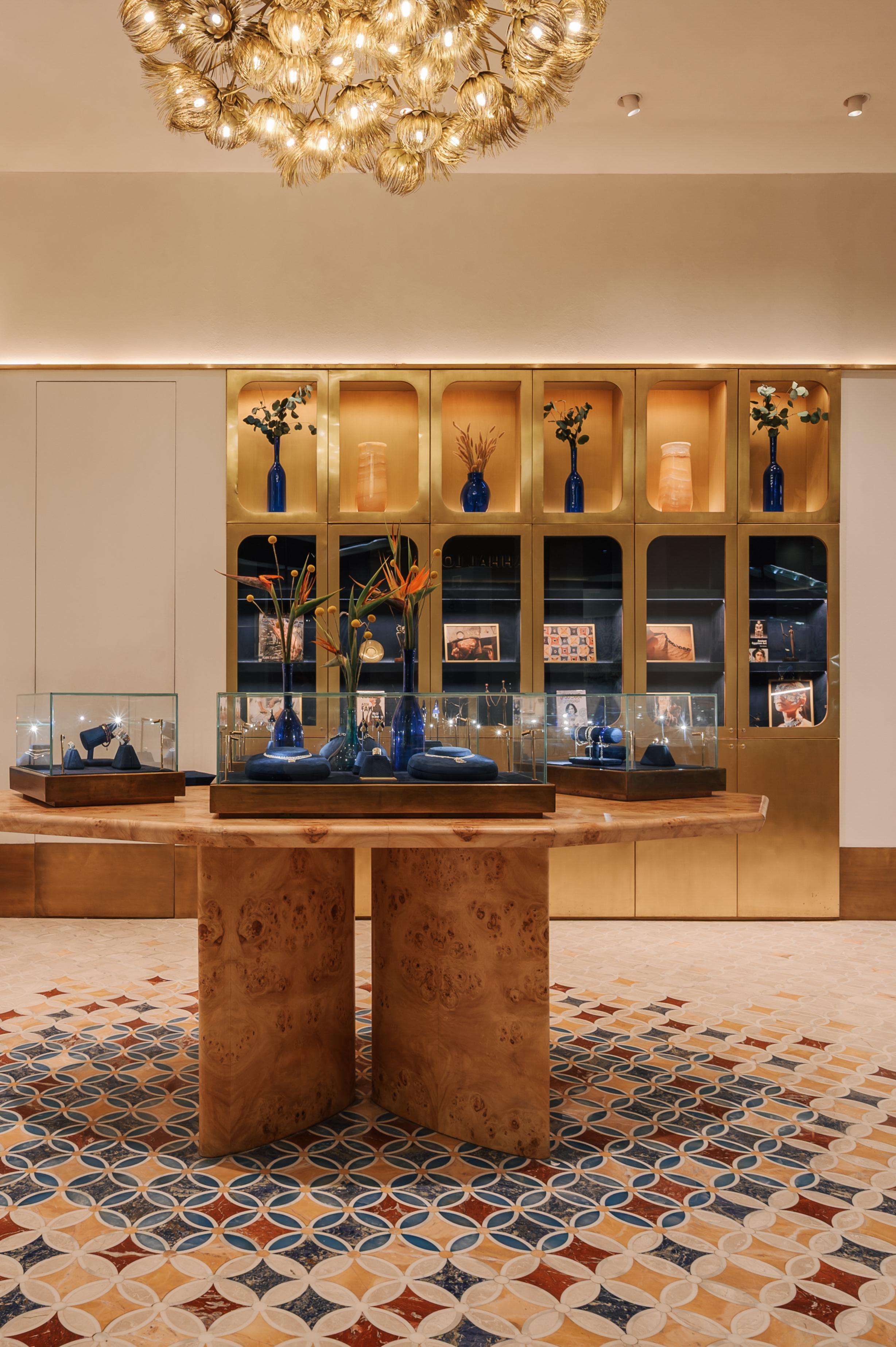
At the center of the store, a bespoke stretched-burl timber decagonal table takes inspiration from a heritage door used as a dining table in the founder’s home, and its geometry references geometric patterns associated with the Mamluk period. A lifestyle cabinet inspired by her library situates the store within its museological context, displaying drawings, travel photographs and materials connected to the research behind the brand’s collections.
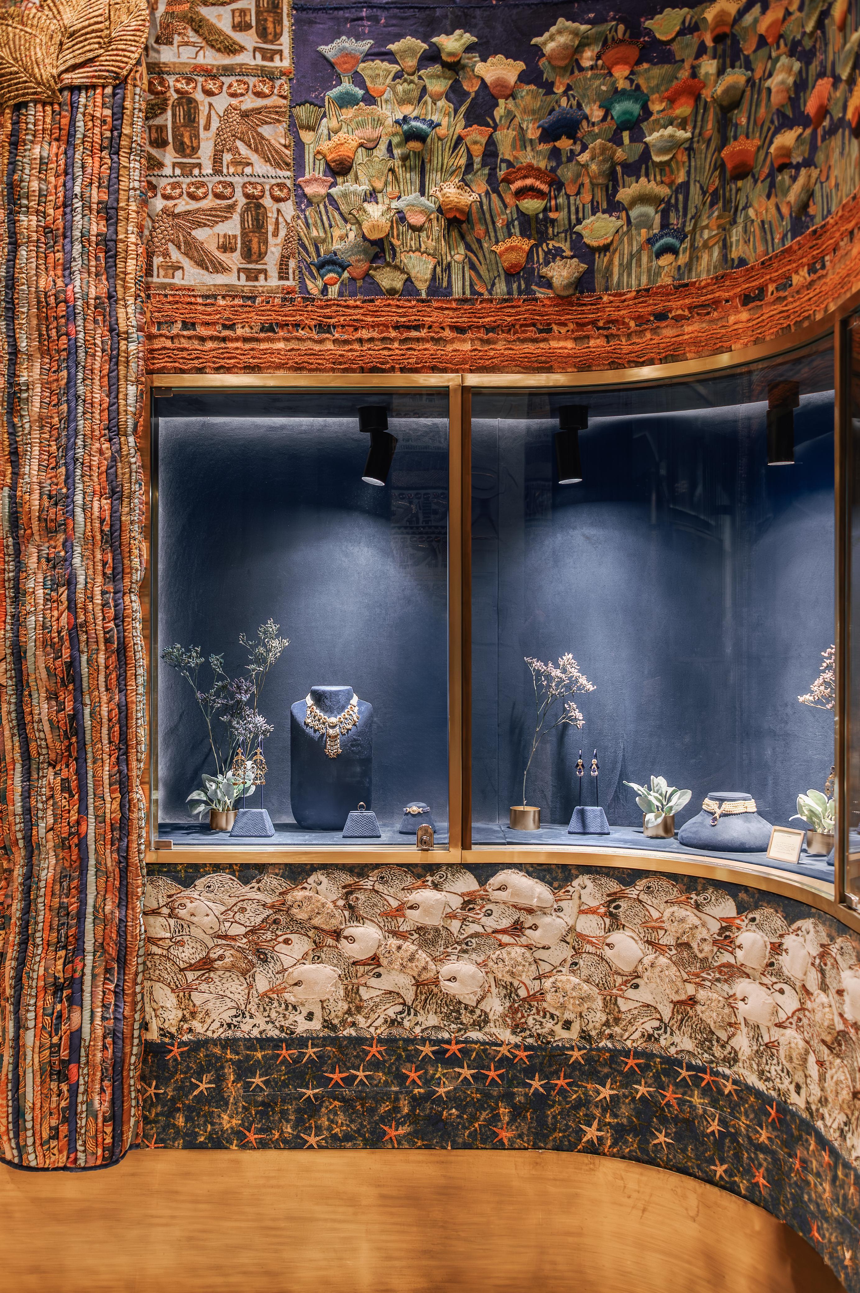
Ancient Egyptian visual references and motifs are seamlessly integrated throughout the space: the intricate marble floor, developed with Egyptian stone supplier Marmonil, is inspired by a painted ceiling found in Nefertari’s tomb in Luxor; a curved petal motif from the same reference appears again in the furniture legs; a central lotus-flower brass chandelier by Randa Fahmy anchors the space; and upholstered walls developed with Bokja and a brass-patterned curtain carry through the store’s material and decorative language.
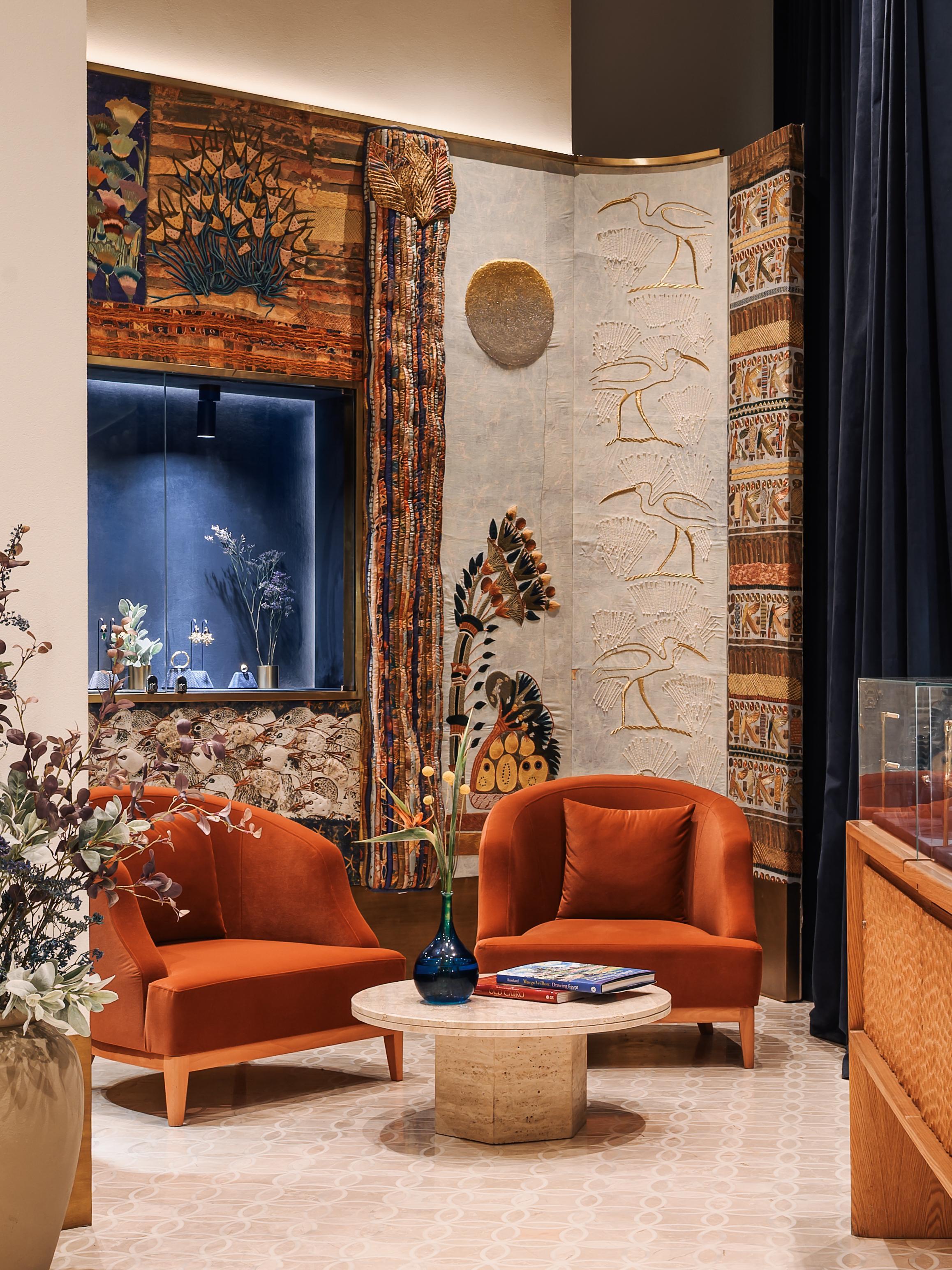
“What stands out most to me is the warmth and layering of the interior,” Gaballa says. The result is an intimate interior that reflects the depth of research and craftsmanship behind Azza Fahmy’s collections, translating its relationship with Egyptian history into a contemporary retail environment.
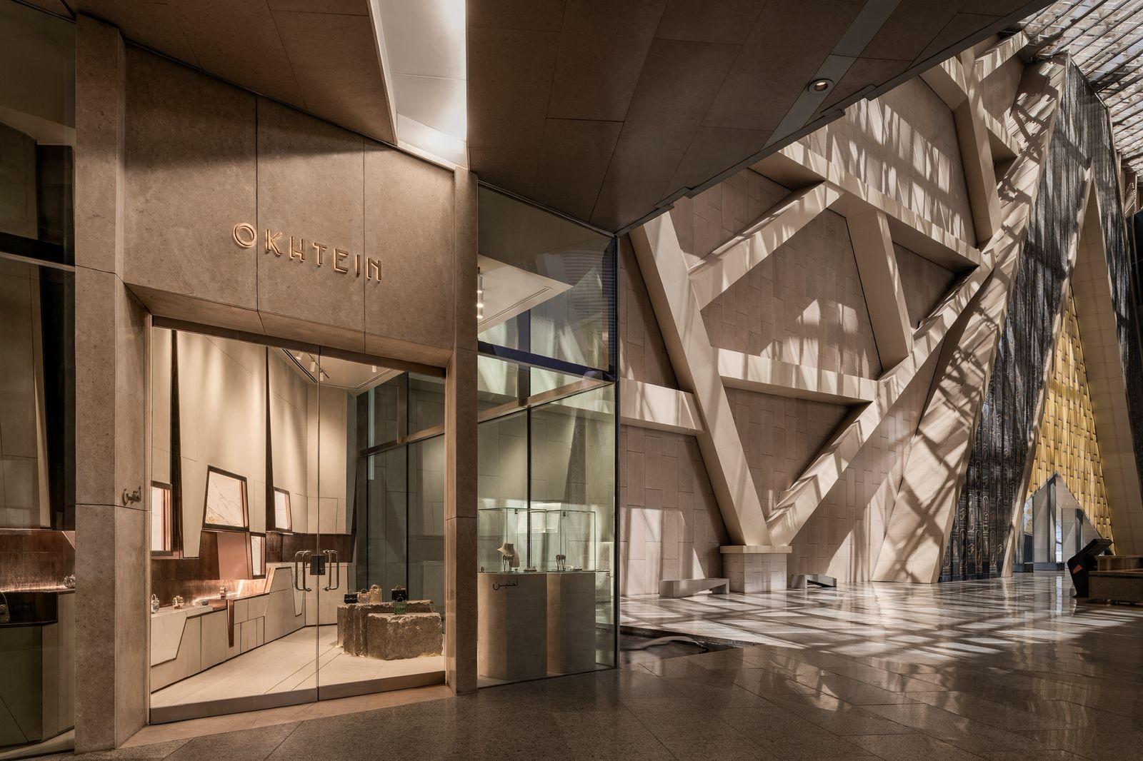
For Okhtein’s store, the GEM offered an opportunity to place an established visual language within a broader cultural context. “We wanted to create a space that could tell our story within a place that holds so much of Egypt’s own,” says Mounaz Abdelraouf, co-founder of Okhtein. Working with Lebanese designer Walid Zeidan, the brand spent months studying the museum and its architecture before developing the store. The Nile emerged as a grounding visual reference, with the forms of the felucca and dahabeya informing decorative elements throughout the space. Copper, inspired by the accents of traditional feluccas, appeared across the store displays and formal details.
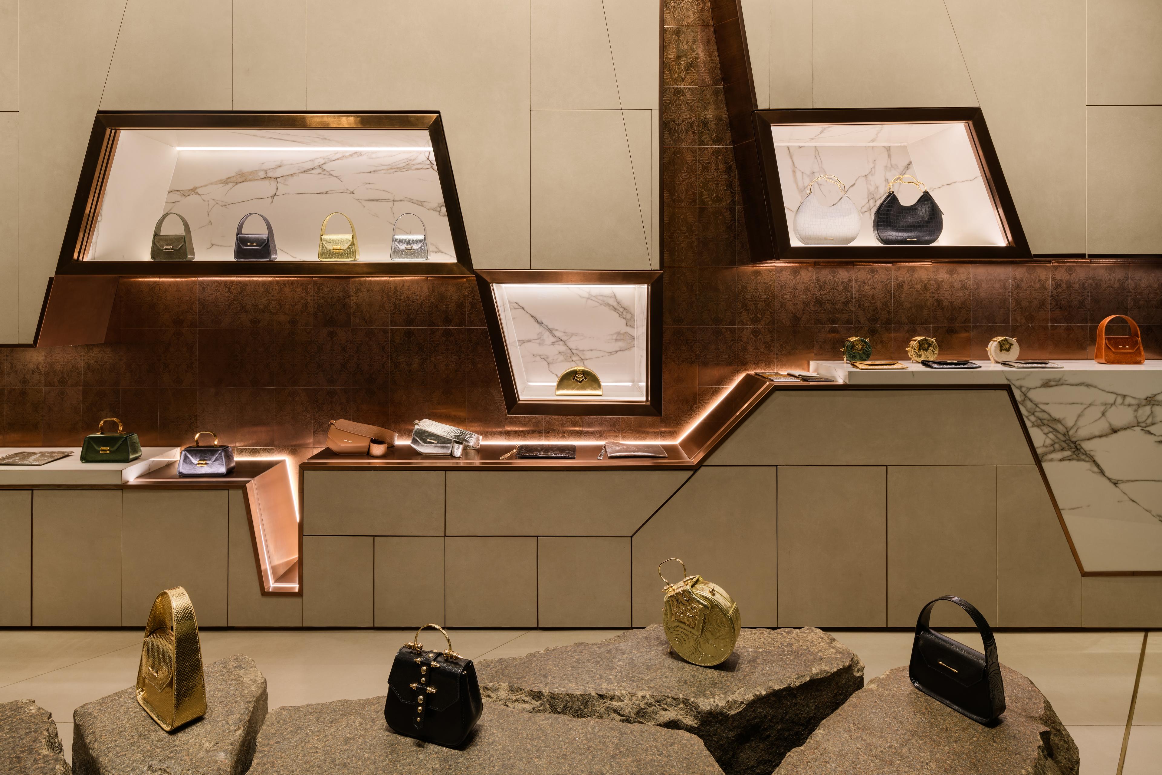
The choice of material and its connotations were central to the store’s concept. Aswani stone was used for the main display, placed directly on the ground to translate its natural character. This use of contextual materials reflects a wider philosophy within Okhtein’s creative direction, where the breadth of Egyptian culture is visualized through an integration of material and craftsmanship rather than literal or symbolic imagery.
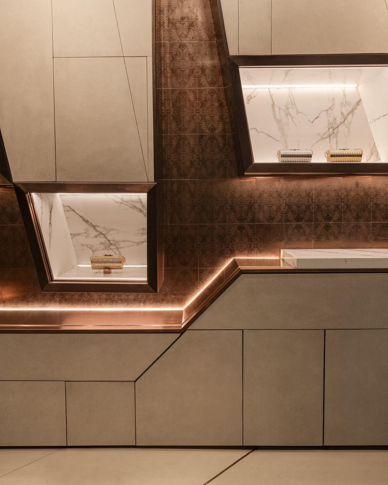
The brand has long worked with artisans in Khan El Khalili, drawing from techniques passed down through generations and incorporating brasswork and handcraft into its collections. References to Egyptian histories also appear across its designs, from the traditional felucca that inspired their iconic Felucca bag to the architecture of Old Cairo, which informed their Minaudiere bag.
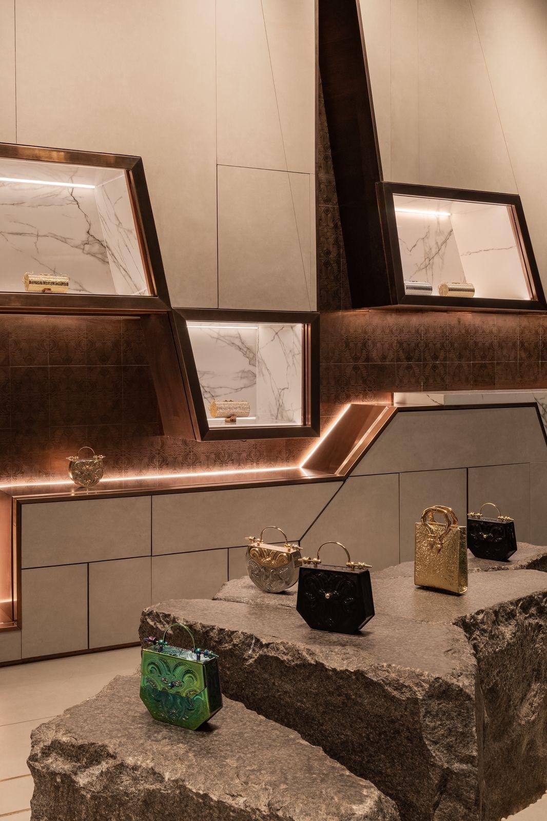
The GEM offered Okhtein less a new visual language to adopt than an opportunity to place its existing one within a larger cultural context. “It connects where we come from with what we are creating now,” says Aya Abdelraouf, co-founder of Okhtein. The store becomes a meeting point between an expression of Egyptian identity that’s preserved through the museum’s collections and one that continues through contemporary design.
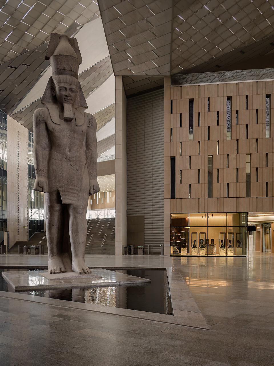
What emerges across five different projects is a diverse set of approaches to the same question: how does a commercial space establish its own identity within an environment that already has a powerful preexisting one? For El-Gharably, the answer lies in visual storytelling, extracting stories and materials from ancient Egyptian mythology and translating them into an experience that remains recognizably Beanos. Kamal, by contrast, is focused on creating a subtle transition for Dima, shifting the viewer through carefully placed visual cues before giving the brand space to establish itself. Makram, meanwhile, moves closer to the museum’s own visual language, borrowing its methods of display and its relationship to objects while reinterpreting them through a contemporary retail lens in Nakhla. In Azza Fahmy’s store, the designers adopt a research-led approach to storytelling, expressed through layered interiors, crafted furniture, and curated objects, and Okhtein uses the museum’s setting to place its existing visual language within a broader cultural context.
The differences are ultimately less about how much Egyptian imagery each store contains than about what each designer believes context can do. It can provide a narrative, as it does for Beanos; establish a subtle point of connection, as in Dima; or become a method for display itself, as in Makram’s interpretation of Nakhla. For Azza Fahmy, history becomes a foundation for research and craftsmanship, and in Okhtein’s store, materiality provides a natural point of continuity between the brand and its setting. Within the GEM, the challenge was to determine how a brand can find its own position within a place that is already telling a story of its own.